Tell your friends about this item:
Confident Stages
Rosemarie Barnes
Confident Stages
Rosemarie Barnes
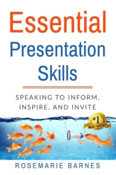
A good idea not shared or understood by others is a shame. A brilliant idea not shared and understood is a tragedy. Public speaking is so much more than the courage to stand in front of a group and talk. For a presentation to be powerful, it must have the right amount of content, organized in a memorable way for both speaker and audience, it must be delivered with power, warmth, and charisma, and it must be spoken in the language of the audience. How much content is enough? How much is too much? Most public speakers work so hard to give great value to their audiences that they inadvertently make a huge mistake; they include far too much information into far too little time. Time is never a speaker's friend. Going overtime in a presentation is an egregious error and rude to the nth degree. How well is your presentation organized? If you must rely on notes, cue cards, or even worse, slides, to keep you on track, the problem is not one of memory; the problem lies in the organization. Excellent speakers use systems and strategies so that the presentation is simple for them to remember and impossible for their audiences to forget. Through good organization, speakers are able to build anticipation, excitement, and engagement; so simple, but not easy. Speakers are not generally trained actors, but they do need to know their way around a performance space. Don't like that word, "performance?" Get over it, because each time a speaker stands to deliver a message they are absolutely, un-categorically, giving a performance. As such, knowledge of stagecraft is as vital as is the message. Which part of the space is the strongest? The weakest? How can a speaker use that information to assist the audience in understanding the message? What are the best ways to enter and exit? A general understanding of how to use presentation spaces properly is extraordinarily valuable to every great speaker. To move or not to move? That is the question. Speakers must fill the space, but (and here's the important bit) they do not have to do it with their feet to do it. Movement can be good. Movement can be effective. Movement can make the audience seasick, drowsy, and provide an opportunity for them to disengage from the presentation and answer e-mails. Too much, or idle movement can and does dilute the message. Period. The trick, of course, lies in using movement with purpose and one of those purposes is NOT to connect with your audience. It is sad but true, that moving to one end of the performance space gets the speaker closer to that side of the audience, but the consequence is to disengage from the other side. Your listeners are there to benefit from your entire presentation, not half of it. There are other, much better strategies to keep the audience engaged the audience at all times, and scant few of them involve cardiovascular exercise for the speaker. Hot on the heels of understanding the effects of movement is the monumental importance of body language. When we feel threatened, nervous or surprised, our reptilian brain immediately takes over and high handedly imposes its control. Adrenalin floods our systems causing us to fight, flee, or freeze with little care as to the physical message we are sending. When an audience sees a conflict between the verbal and physical messages they will always, always, believe the physical over the verbal. If you want the listeners to like you, understand you, and trust you, (and that is the point, isn't it?) then the messages you send absolutely must be unified. From the tilt of the head to the direction of the toes, be sure the story being told is the you intend. Now add in the secret ingredient of vocal control, the fine art of linguistic choices, and the careful use of charisma, and we have the recipe for creating excellence in public speaking.
| Media | Books Paperback Book (Book with soft cover and glued back) |
| Released | October 19, 2016 |
| ISBN13 | 9781539483595 |
| Publishers | Createspace Independent Publishing Platf |
| Pages | 110 |
| Dimensions | 152 × 229 × 6 mm · 158 g |
| Language | English |


